Calibration Science, Part III: Calibration Lines and Correlation Coefficients
A practical discussion of how to plot calibration lines and how to calculate calibration line equations.
In this installment of the calibration science series, we discuss how to plot calibration lines and how to calculate calibration line equations. Next, a measure of calibration line quality, the correlation coefficient, is introduced. Lastly, the importance of only using a calibration line in the range where calibration data exists is emphasized.
Calibration Lines
This is the third installment in a series of articles on calibration science. I recommend reading the previous two installments if you are completely new to this field (1,2).
As an introduction to calibrations, imagine we want to measure the amount of isopropyl alcohol (IPA, not the beer India Pale Ale), dissolved in water by mid-infrared spectroscopy. We would then need to measure spectra of samples of known IPA concentration called standards (3). Figure 1 shows the mid-infrared spectra of a series of standard samples of known volume percents of IPA dissolved in water.
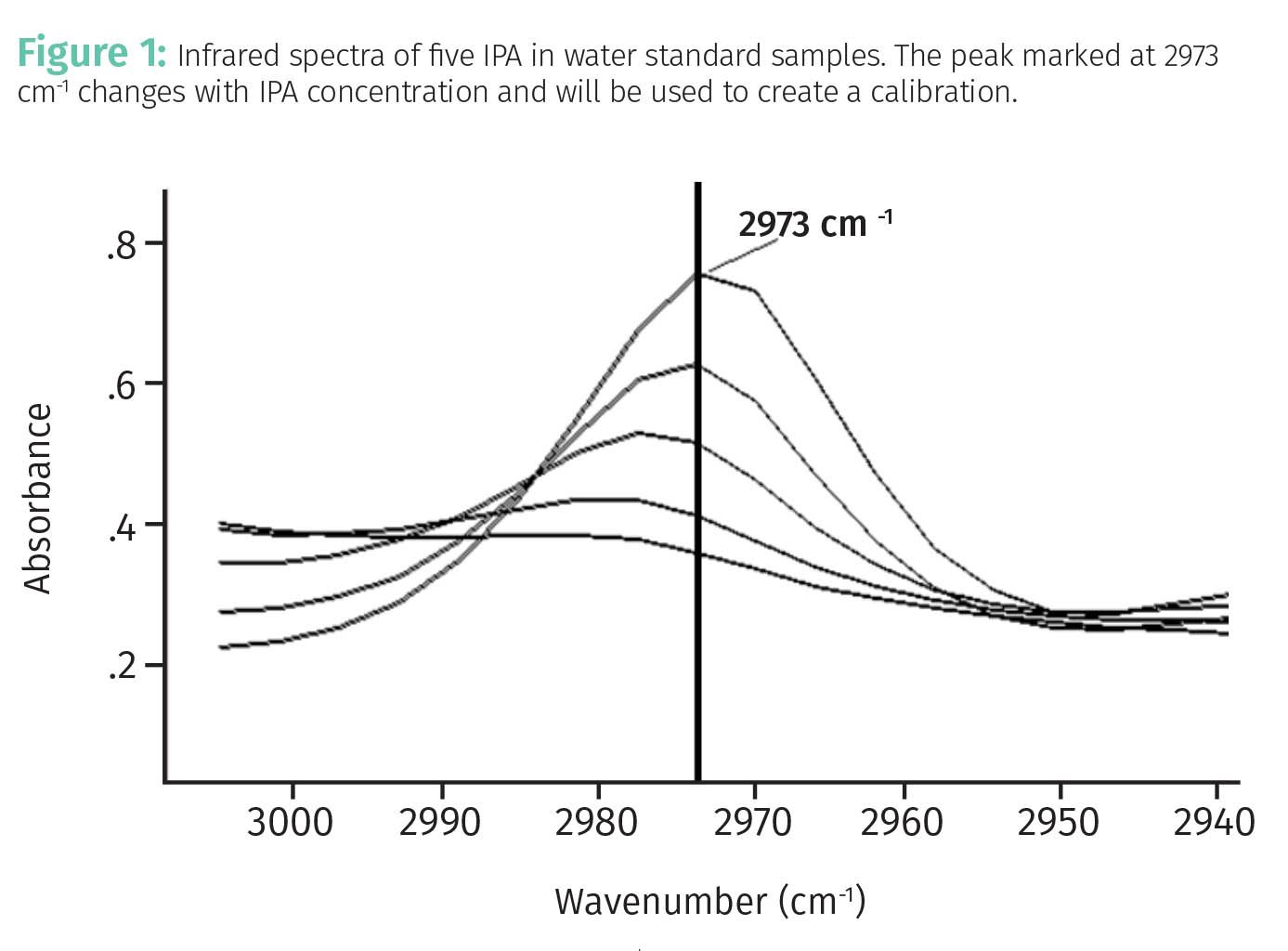
Examination of the infrared spectra of the standards in the figure shows that the peak at 2973 cm-1 (wavenumbers), marked in Figure 1, changed with IPA concentration. This indicates this peak can be used to quantitate the amount of IPA in water.
A well-known equation of analytical chemistry, Beer’s Law (3) relates spectral peak height or area measured in absorbance units to concentration as such, as seen in Equation 1:

where A is the absorbance, typically measured as a peak height or area in a spectrum and is a measure of the amount of light absorbed by a sample; ε is the absorptivity, the proportionality constant between absorbance and concentration for a given analyte at a given wavenumber; l is the pathlength, a measure of sample thickness; and c is the concentration.
Table 1 shows the peak areas of the IPA peak for the five standard spectra seen in Figure 1.
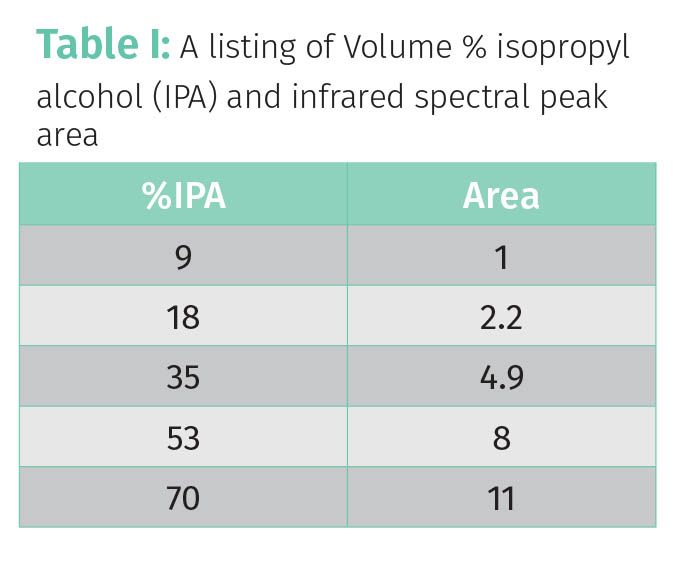
The left column lists the volume percent IPA in the standard samples whose spectra are seen in Figure 1. The right column lists the area of the 2973 cm-1 IPA peak as illustrated in Figure 1. Based on the data in Table 1, it appears that as %IPA goes up, peak area goes up. Thus, these two quantities are related to each other, and it would make sense to plot these data to determine the nature of this relationship. This plot is seen in Figure 2.

According to Beer’s Law, a plot of peak area versus concentration should yield a straight line (3), which is exactly what we see in Figure 2. The line in Figure 2 is called a calibration line because it is a mathematical model that shows a linear relationship between two sets of data. The relationship in Figure 2 between concentration and peak area is said to be linear because a line does an excellent job of connecting the data points. In this case, the two sets of data are peak area and concentration, but calibration lines can be used to relate any two sets of data so long as their relationship is linear.
A calibration line is a plot with two axes that shows the relationship between two sets of data, and is said to be two-dimensional, with each dimension representing one of the data types being plotted. In our case one of the dimensions is peak area and the other is %IPA, meaning a calibration line is two-dimensional. The calibration line in Figure 2 can be used to calibrate an infrared spectrometer to determine the amount of IPA dissolved in unknown water samples.
For all plotted lines, including calibration lines, the horizontal axis is called the x-axis, and the vertical axis is called the y-axis. All plots of lines should contain a title, x-axis label, y-axis label, symbols representing the individual data points, grid lines, the line itself, and numbers representing the scale on each axis. All of these are seen in Figure 2. The title of the plot is “peak area calibration for IPA,” the x-axis label is “%IPA,” and the y-axis label is “peak area.” The x-axis scale goes from 0% to 80% IPA, and the Peak Area scale goes from 0 to 12. Five data points are represented by the diamonds in the figure, and a line has been drawn “fitted” to these data points (more on this in later columns). Figure 2 can be used to determine the %IPA in unknown samples by measuring the peak area of the 2973 cm-1 peak, finding this point on the y-axis, moving horizontally to where the line is reached, and then reading down vertically to see where you are on the x-axis; that will give you the predicted %IPA. There are ways to do this using equations rather than this method—more on that later. Calibration lines are important in cannabis analysis because they enable instruments to make quantitative measurements, such as the total tetrahydrocannabinol (THC) in a cannabis bud via chromatography, or the amount of pesticide in a vape pen formulation via mass spectrometry.
Equations from Lines
As you may recall from high school algebra, the equation for a straight line is given by Equation 2:

where Y is a y-axis data point, X is the corresponding x-axis data point, m is the slope of line, and b is the y-intercept of the line.
The X and Y in Equation 2 are a pair of corresponding data points. For example, each row in Table 1 is a set of data points containing an x-axis concentration data point and its corresponding y-axis peak area. Plotting these five pairs of data points provided the line seen in Figure 2.
The slope, m in Equation 2, measures just that. Imagine the line is a hill you are going to climb: steep lines have large slopes and less steep lines have smaller slopes. The slope of any line can be calculated with two data pairs using the “rise over run” or Rise/Run method as illustrated in Figure 3.
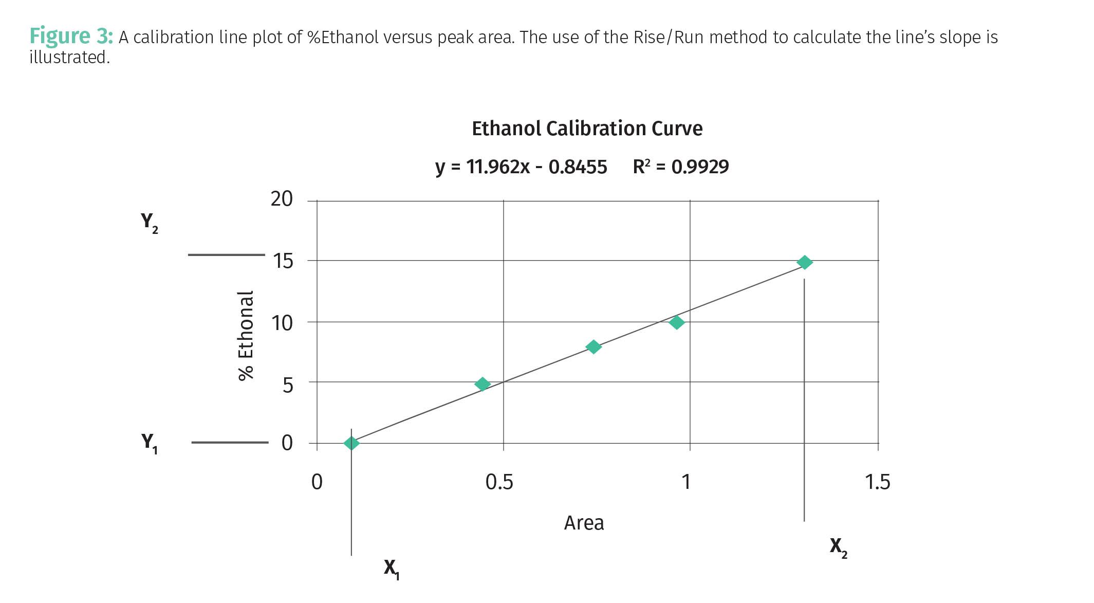
For the calculation of the slope of the line in Figure 3 we will use the first and fifth data pair as illustrated. The “Rise” of the line in Figure 3 is the difference between the highest y-axis data point, Y2, and lowest y-axis data point, Y1 as given by Equation 3:

Equation 3 gives the “Rise” because as you can see in Figure 3 the value of the y-axis data points goes up vertically on the y-axis as we move from left to right across the plot. The “Run” of the line in Figure 3 is the difference between the largest x-axis data point, X2, and smallest x-axis data point, X1, as given by Equation 4:

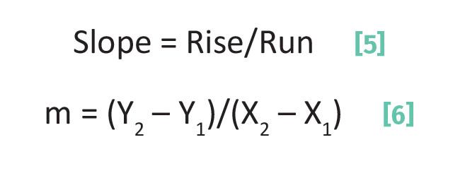
The slope of any line then is given by Equations 5 and 6.
In theory, any two data pairs comprising the line can be used to calculate the line’s slope.
The second term in Equation 2 is b, the y-intercept. This number measures where the line crosses the y-axis. For instance, if b = 0 it means the y-intercept is zero and the line passes directly through the origin of the x,y axis system where the x and y axes meet. A value of b > 0 means the line crosses the y-axis above the x-axis, whereas for values of b < 0 the line crosses the y-axis below the x-axis. To calculate the y-intercept we first rearrange Equation 2 to give Equation 7:

where b is the y-intercept, Y is the y data point in a data pair, X is the x data point in a data pair, and m is the slope.
Thus, to calculate b using Equation 7 we need to know the slope as calculated from Equation 6 and the values of one x,y data pair. The equation of the line plotted in Figure 3 is given at the top of the figure and in Equation 8:

Equation 8 means that for this line the slope is 11.962 and the y-intercept is -0.8455. This means the line crosses the y-axis just below the origin.
Now, back in the Jurassic Era when I first started practicing analytical chemistry, there we no computers or calculators. This meant lines were plotted using graph paper, rulers, and pencils. The equation for the line was calculated using Equations 6 and 7. Of course since then things have improved markedly, and computers can do all this work for us. For example, spreadsheet programs such as Microsoft® ExcelTM make plotting lines and calculating their equations a breeze compared to the past, and I would recommend using these programs going forward.
Programs such as Excel use what is called a “least squares fitting” algorithm to plot lines and determine their equations (more on least squares fitting in a later column) using all the x,y data pairs in a plot. For example, Equation 8 was calculated using all 5 data pairs shown in Figure 3. However, I walked us through Equations 2 through 8 to illustrate the math behind how fitting algorithms work.
Correlation Coefficient
If you look at the top of Figure 3 there is an equation (Equation 9) that says:

where R2 is a quantity called the correlation coefficient. The correlation coefficient is a measure of model quality. For a two-dimensional plot such as a calibration line the correlation coefficient is a measure of model linearity—how well the relationship between the actual data points conforms to an idealized linear relationship. In other words, R2 in this case is a measure of how linear the correlation is between two data sets. The correlation coefficient falls on a 0 to 1 scale where 1 is a perfect correlation and 0 means there is no correlation at all between the two data sets. If R2 = 1 it would mean, for example, that the calibration lines in Figures 2 and 3 would pass dead center through all the data points in the plot. This of course never happens because of noise as we have discussed previously (1,2). The difference between the data points and lines in Figures 2 and 3 determines R2. The further the data points are off the line, the worse the correlation coefficient, and the closer they are, the better R2 become. A correlation coefficient of 0 means there is absolutely no relationship between the two quantities being plotted. Such a plot would look like a random scatter of data points.
Equation 9 shows that the R2 for the line plotted in Figure 3 is 0.9929. This is excellent because it is very close to the perfect value of 1. Analytical chemists like to brag about “how many nines” the correlation coefficient for their calibrations contain. We would say the calibration in Figure 3 is good to “two nines”, while a calibration with an R2 = 0.9997 would be good to “three nines”. In general, in analytical chemistry, we strive for calibration lines with R2 values of 0.9 or better, with values of 0.99 or above being preferred and considered very good. Calibration lines with R2 values less than 0.9 may have some utility, but the predictions based on them can be so noisy as to be useless. In a previous column we discussed noise sources and how to reduce them (1). The equation used to calculate the correlation coefficient will be discussed in a future column.
As a more relevant example to cannabis analysis from my own work, Figure 4 shows a calibration line for the quantitation of tetrahydrocannabinolic acid (THCA) in cannabis extracts via mid-infrared spectroscopy (4).
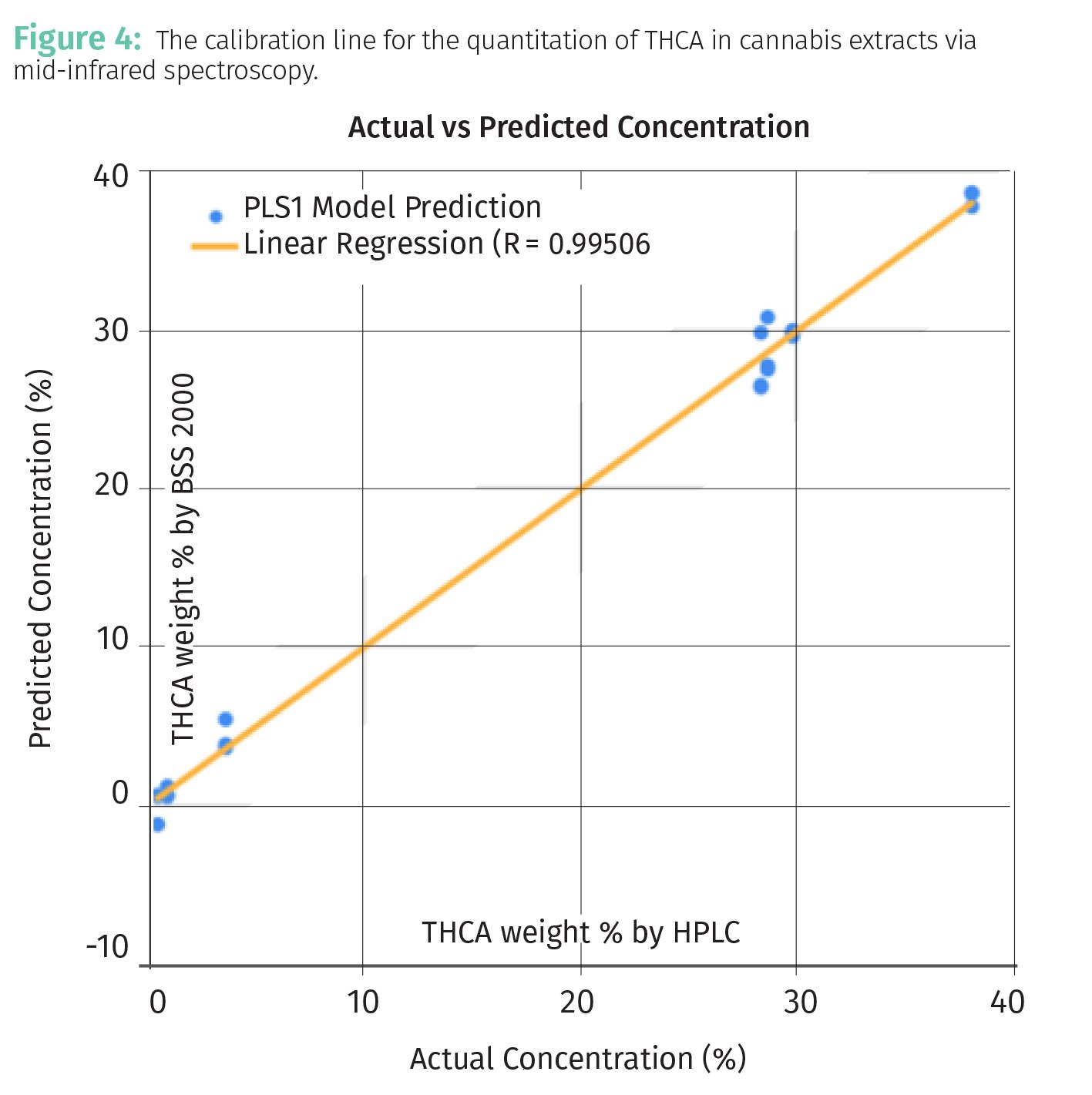
In this work a sample of cannabis extract is placed on a window, scanned with infrared light, and using Beer’s Law (see Equation 2) the calibration line seen was obtained. The R2 value in the figure, 0.995, would be an example of a “two nines” calibration and although I am biased, the quality of this calibration might be worth bragging about.
Calibration Line Limits
There are three calibration lines seen above, Figures 2, 3, and 4. The range of a calibration line is the difference between its maximum and minimum data points as given by Equation 10:

Using the data in Table 1, the range for the %IPA data is (70%–9%) or 61%, for the calibration line seen in Figure 3 the range for %Ethanol is 15%, and for the calibration line seen in Figure 4 the THCA range is about 40%.
Knowing the range of a calibration line is important because the calibration line cannot be used outside the range for which there is data. For example, let’s say we used the %IPA calibration in Figure 2 to analyze an unknown sample and found a value of 5% IPA. This result cannot be used because the lowest concentration standard sample that was analyzed was 9% IPA. We cannot use this calibration for measurements below 9% IPA or above 70% IPA because we have no data in these concentration ranges. To use a calibration line outside its range means we are extrapolating the line into an unknown area where there is no data. It is always tempting but always wrong to extrapolate calibration lines. The problem is we have no idea what the behavior of this line is above 70% or below 9%; the slope could change, or the correlation could go completely awry. To generalize then, calibration lines should never be used outside the range for which there is data.
Conclusions
We introduced the concept of plotting lines, calculating their equations, and how calibration lines are two dimensional mathematical models that relate one set of data to another. We then discussed a measure of calibration quality, the correlation coefficient, and wrapped up emphasizing the importance of not using calibration lines outside the range for which there is calibration data.
References
- Smith, B., Calibration Science, Part I: Precision, Accuracy, and Random Error, Cannabis Science and Technology, 2023, 6(9), 6-9.
- Smith, B., Calibration Science, Part II: Systematic Error, Signal-to-Noise Ratios, and How to Reduce Random Error, Cannabis Science and Technology, 2024, 7(1), 8-11.
- Smith, B., Quantitative Spectroscopy: Theory and Practice, Elsevier, New York, 2002.
- Smith, B., Terpenes and Testing, January 2018.
About the Columnist

Brian C. Smith, PhD, is Founder, CEO, and Chief Technical Officer of Big Sur Scientific. He is the inventor of the BSS series of patented mid-infrared based cannabis analyzers. Dr. Smith has done pioneering research and published numerous peer-reviewed papers on the application of mid-infrared spectroscopy to cannabis analysis, and sits on the editorial board of Cannabis Science and Technology. He has worked as a laboratory director for a cannabis extractor, as an analytical chemist for Waters Associates and PerkinElmer, and as an analytical instrument salesperson. He has more than 30 years of experience in chemical analysis and has written three books on the subject. Dr. Smith earned his PhD on physical chemistry from Dartmouth College. Direct correspondence to: brian@bigsurscientific.com
How to Cite this Article
Smith, B., Calibration Science, Part III: Calibration Lines and Correlation Coefficients, Cannabis Science and Technology, 2024, 7(2), 6-11.
